Custom Data Visualization Tools: A Business Buying Guide


What if the best data visualisation tool isn’t the one with the biggest chart catalogue, but the one that fits the decisions your team needs to make? Custom data visualization tools can bring scattered data into a clearer view, but bespoke development isn’t automatically the right answer.
If information is split across systems, generic dashboards can leave teams working around fixed layouts, reporting rules or workflows. It’s also important to weigh the build effort, integrations, performance and ongoing support a tailored solution may require. The right choice starts with how people use data, not with a list of features.
This guide compares bespoke development with configurable platforms, helping you define requirements and evaluate options before committing. You’ll consider data sources, users, workflows, governance, scalability and ownership, then assess when a custom application could offer value that an off-the-shelf platform cannot. The aim is to find a practical fit between your data and the decisions your organisation needs to make.
A chart displays data. A visualisation tool helps people find the right data, understand it in context and decide what to do next. For a general introduction, Data visualization covers how information can be represented visually. In a business setting, custom data visualization tools are software shaped around an organisation’s data, users and decisions.
The chart or dashboard is only the visible layer. The wider product may also need to connect source systems, prepare and define data, control who can see particular information, and fit into existing work routines. A sales manager might need a recurring view of performance by team; an operations lead may need to investigate why delays are increasing; a senior stakeholder may need a concise report for planning. Each view should support a specific user, decision and next action.
When reporting is spread across systems, staff may spend time assembling information before they can interpret it. A shared operational dashboard could bring relevant measures together so a team can spot an issue and follow up. An exploratory interface, by contrast, lets an analyst filter and compare data to investigate a trend. Stakeholder reporting usually prioritises consistent definitions and a clear summary over detailed exploration.
These needs don’t automatically call for a bespoke build. If a configurable platform can connect to the required sources and support the right users and reporting cadence, it may be the more practical fit. Start with the task the interface must improve, rather than assuming custom software is better.
Configuring existing dashboard software can involve selecting charts, arranging layouts and setting available filters. Tailored application development goes further: it can bring together specific data connections, role-based views, business rules and steps embedded in a team’s workflow. The distinction is not simply how a dashboard looks, but how well the underlying product reflects the organisation’s operating needs.
A bespoke visualisation tool is an application built around an organisation’s data flows, user roles and decision-making workflows, rather than a dashboard configured within a general-purpose platform.
For example, different teams may need access to different measures, or a view may need to apply business-specific rules for grouping figures. That requires decisions about data access and definitions as well as interface design. A tailored web application can connect systems through APIs and present selected information in a purpose-built interface, but it also brings delivery and maintenance responsibilities. Building is most compelling when configuration alone cannot meet those requirements effectively.
A useful interface depends on a reliable path from source data to a decision. Information may start in finance software, a customer database or an operational system. An API can pass selected data to a web application, where it may be checked, combined and organised before appearing as a chart, table or alert. Each step needs clear rules: inconsistent categories or duplicate records can make even a polished visual misleading.
Define key measures before designing screens. If teams use different rules for what counts as an active customer, for example, the same metric may produce conflicting results. Set the expected refresh frequency too. A daily update may suit a planning report, while a process that depends on current information needs a different approach. Harvard Business School Online discusses how data visualization tools for business can make information more accessible and support decision-making.
A dependable visualisation workflow connects trusted sources, agreed definitions, appropriate access and clear interfaces to the decisions people need to make.
Before choosing an integration approach, record each source, its format, update frequency, data owner and access constraints. This inventory can show whether information is available through an API, needs preparation before use or cannot be accessed by the intended application. API integration may connect existing platforms to a custom web application, but the design should account for how failures, changes and data delays will be identified and handled.
Define ownership as well as access. Decide who can view, change or approve business-critical information, and who is responsible for resolving errors at the source. Role-based views should give people the information they need for their work without exposing unrelated or sensitive records.
Start with the question each user must answer. A trend over time may call for a line chart; exact values or comparisons across categories may be clearer in a table or bar chart. Keep labels direct, provide enough context to interpret figures, and avoid using colour as the only signal. Keyboard access and sufficient colour contrast also deserve attention during design, not just final testing.
Interactive application interfaces can support filtering and focused views when those controls help users explore information. Larasoft’s Vue.js frontend development guide offers context on that frontend approach. If data connections or a tailored interface are part of your requirements, a development partner such as Larasoft can be considered alongside other options.
Choose an approach by testing it against defined requirements, not by assuming that a custom build is more capable or that a configurable platform will always be quicker. A platform may meet established reporting needs with less development work. Bespoke development can shape the interface and workflow more closely, but it adds delivery and ongoing maintenance responsibilities.
| Consideration | Configurable platform | Bespoke development |
|---|---|---|
| Configuration | Uses available settings, templates and dashboard features. | Builds application features around agreed requirements. |
| Integration | Works with supported connectors and data structures. | Can be designed around specific systems and data flows. |
| Flexibility | Fits common reporting patterns; changes depend on platform capabilities. | Can support specialised interfaces and workflows. |
| Ownership | Teams still need to govern definitions, access and reports. | The organisation must plan for testing, maintenance and future changes. |
An existing platform may be sufficient if its connectors, permissions and dashboard patterns support the data sources and tasks your users actually have. Check whether teams can create or maintain reports without duplicating data or defining the same measure differently across dashboards. If a requirement is unmet, identify the specific gap, such as a missing connection or workflow, and confirm whether configuration can address it before considering a new build.
Account for the effort of setting up and governing the platform too. User training, consistent metric definitions and report ownership matter alongside the interface. A familiar tool may be a good fit when it supports the required decisions and teams can operate it reliably.
Custom data visualization tools may be worth assessing when a business-critical process depends on a specialised user journey, a particular combination of data sources or an integration that existing products cannot support adequately. For example, a team may need visual reporting embedded in a wider application rather than accessed through a separate dashboard. The case depends on a documented need, not a preference for a unique design.
Be clear about the trade-off: custom development takes planning, implementation and testing, and the resulting application needs an owner for maintenance and future changes. Review whether your organisation can sustain those responsibilities and how requirements may evolve. If older systems affect the options for connecting data, legacy code modernisation may also be relevant. Compare the total effort for both approaches, including configuration, integration, training and ongoing ownership, before choosing a direction.
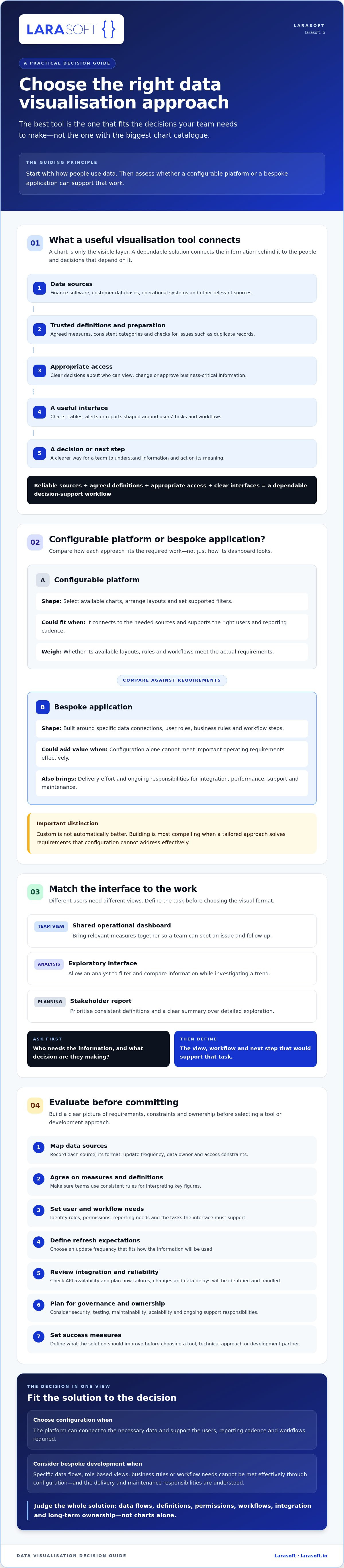
Set the intended outcome before comparing platforms, suppliers or technical designs. Decide what should improve, such as how quickly a team can find a performance issue, how accurately it can interpret a measure, or whether stakeholders receive the reporting they need. These success measures give you a basis for comparing options and checking whether a prototype works.
Separate essential requirements from useful extras. Record who will use the tool, which decisions it should support and what information each group needs. Then document the data sources, key measures, expected update frequency, permissions, audit needs, accessibility expectations and system constraints. This gives technical reviewers a practical view of the work without locking the organisation into a particular tool or architecture too early.
A prototype should test a real task with representative users and appropriately governed sample data. Ask users to interpret the information and complete the intended action without extensive explanation. Their feedback can reveal whether labels, visual hierarchy and interaction patterns make sense.
Check the underlying assumptions too. Compare displayed values with their source, observe loading behaviour under conditions relevant to your use case, and verify that the proposed integrations can supply the required data. Set project-specific thresholds for accuracy and performance rather than relying on arbitrary benchmarks. If the data flow or task fails this test, refine the approach before adding features.
For organisations assessing a tailored application, discuss your development requirements with Larasoft after documenting the needs, constraints and success measures you want a partner to evaluate.
A sound project starts with a shared brief, not a preferred framework or chart library. Your development partner should clarify who will use the application, which decisions it needs to support, where the data comes from and how success will be assessed. They should also surface integration risks early, such as unclear data ownership, inconsistent definitions or limits in existing systems.
Use that brief to assess technical fit across the whole application. A backend may need to retrieve and prepare data, while the frontend presents it in a way that supports user tasks. API integration can connect systems where appropriate, and security, testing and maintenance should be considered alongside the initial build. Larasoft’s capabilities include bespoke web application development, Laravel backends, Vue.js and React frontend development, API integration and software maintenance. These are relevant building blocks, not a claim that Larasoft sells a standalone visualisation product or has experience with a particular charting library.
Ask how the team will validate user requirements, metric definitions and assumptions about data access and integration. Request a clear account of the testing approach, documentation, handover and how future changes will be managed. Clarify who owns ongoing maintenance and what responsibilities remain with your organisation.
Check evidence before relying on specialist claims. If a partner proposes a particular visualisation library or says it has delivered comparable work, ask for relevant examples and confirm how that experience applies to your requirements. A credible discussion should distinguish verified capability from an option that still needs technical evaluation.
Plan for change from the outset. Source systems may evolve, permissions may need updating, and teams may revise business definitions or request different views. Agree how user feedback will be reviewed and how updates to dependencies, testing and application maintenance will be handled. A named owner and clear change process help prevent the tool from becoming difficult to support as its use expands.
For custom data visualization tools, long-term value depends on the structure behind the interface as much as the first release. Once you’ve defined your requirements, success measures and ownership expectations, discuss a bespoke application with Larasoft to explore whether its software development capabilities fit your project.
The right choice starts with the decisions your teams need to make, then works back through users, data, integrations and ownership. Configurable platforms may fit established reporting needs; bespoke development is worth assessing when specific workflows or data connections cannot be supported effectively through configuration. Either way, define success measures and test the most critical requirements before committing.
Custom data visualization tools are only useful if people can trust the information, understand what it shows and act on it. That depends on sound data definitions, considered interface design and a realistic plan for testing, maintenance and future changes.
Larasoft’s relevant capabilities include bespoke Laravel web application development, Vue.js and React frontend development, API integration and ongoing software maintenance. If you’ve clarified your requirements and want to explore whether a tailored application is a good fit, discuss your bespoke application requirements with Larasoft. A clear brief is a strong foundation for building something your organisation can use and maintain with confidence.
Custom data visualization tools are software interfaces designed around an organisation’s data, users and decisions. They may connect existing systems, apply business-specific rules and present relevant information through dashboards, charts, tables or workflows. The term can describe a bespoke application or tailored functionality within a wider product. Define who needs the information and what action it should support before comparing solutions.
Not automatically. An existing platform may suit your organisation if its data connections, permissions and reporting features meet users’ needs. Bespoke development may be worth considering if an essential integration or workflow isn’t supported adequately. Compare the effort required to configure, operate, maintain and adapt each option. Before committing, test the most important user task to check whether your chosen approach works in practice.
Start by listing the users, decisions, data sources and update frequency the tool must support. Document integration, permission, accessibility and maintenance requirements, then compare platforms and custom development against those needs rather than feature lists alone. Test the highest-risk data flow and a representative user task through a prototype or structured evaluation. This helps reveal gaps before you select a product, supplier or technical approach.
They can, provided each system offers a suitable way to access its data and the project accounts for formats, permissions, refresh expectations and reliability. APIs may connect applications, but each source needs to be assessed rather than assumed compatible. Confirm data ownership and quality with the relevant teams. Testing representative data flows early can expose access restrictions, inconsistent records or other integration constraints before the design expands.
There isn’t a reliable universal figure, because the effort depends on factors such as data sources, integrations, user roles, security requirements, interface complexity and ongoing support. Compare proposals by reviewing scope, assumptions, testing, handover and maintenance, not headline figures alone. Ask providers to clarify what’s excluded and how future changes are handled. A detailed brief makes it easier to compare approaches on a like-for-like basis.
Consider a bespoke build when an important business decision depends on a workflow, integration or user experience that existing tools can’t support adequately. First check that the need is clearly defined, the required data is accessible and trustworthy, and your organisation can take responsibility for the software over time. A focused prototype can test the user task and technical assumptions before you commit to a broader delivery.
Describe the intended users, decisions, essential metrics, data sources, permissions and expected update frequency. Explain the problem the project should address and how you’ll assess success. Include accessibility, security, integration, performance and maintenance requirements for technical review, while separating essential needs from optional features. Ask prospective partners how they’ll validate user requirements, data definitions and integration assumptions before proposing an architecture.
Here’s what we've been up to recently.
Certified Quality. Great Prices